Developing a new JSON Schema Brand and Website


Earlier in the 2023 we were approached by Benjamin and the Team at JSON Schema to help them design their new site. We jumped at the chance because it was a bit of an open book. There were very little brand guidelines so there was an opportunity to help develop and define a brand structure and refresh the site in a new direction.
Brandmark and Logo Development


We began the process by discussing with Benjamin and the team whether they would be open to the suggestion of extending the brand before we started on the designing the site. We could see that we needed more design collateral to compliment the documentation and as it did not exist yet we had to think about a style and look with JSON Schema teams agreement.
The branding for JSON Schema was light at this point in consisted of a logo, logotype, a font, and a single colourway. Our aim was to extend their brand collateral so that they had more assets and collateral to play with and essentially handing over a design kit.
The JSON Schema mark is quite an established mark within the community so, we had to mindful that we didn't take the ethos of the mark away but merely refine what is already there. The idea being that we didn't want to completely change a mark that the community identified with. We took the logotype which appeared quite condensed and started to play around with idea to open it up and adjusting the proportions.
So, the exercise became one of expanded the mark, adding geometric feel, and opening up the mark that existed and balancing out each artifacts that makes up the brandmark and logotype. We redrew the logo and the artifacts and adjusted the logotype to balance out the weight of the brandmark whilst also balancing out the clear areas proportionally.
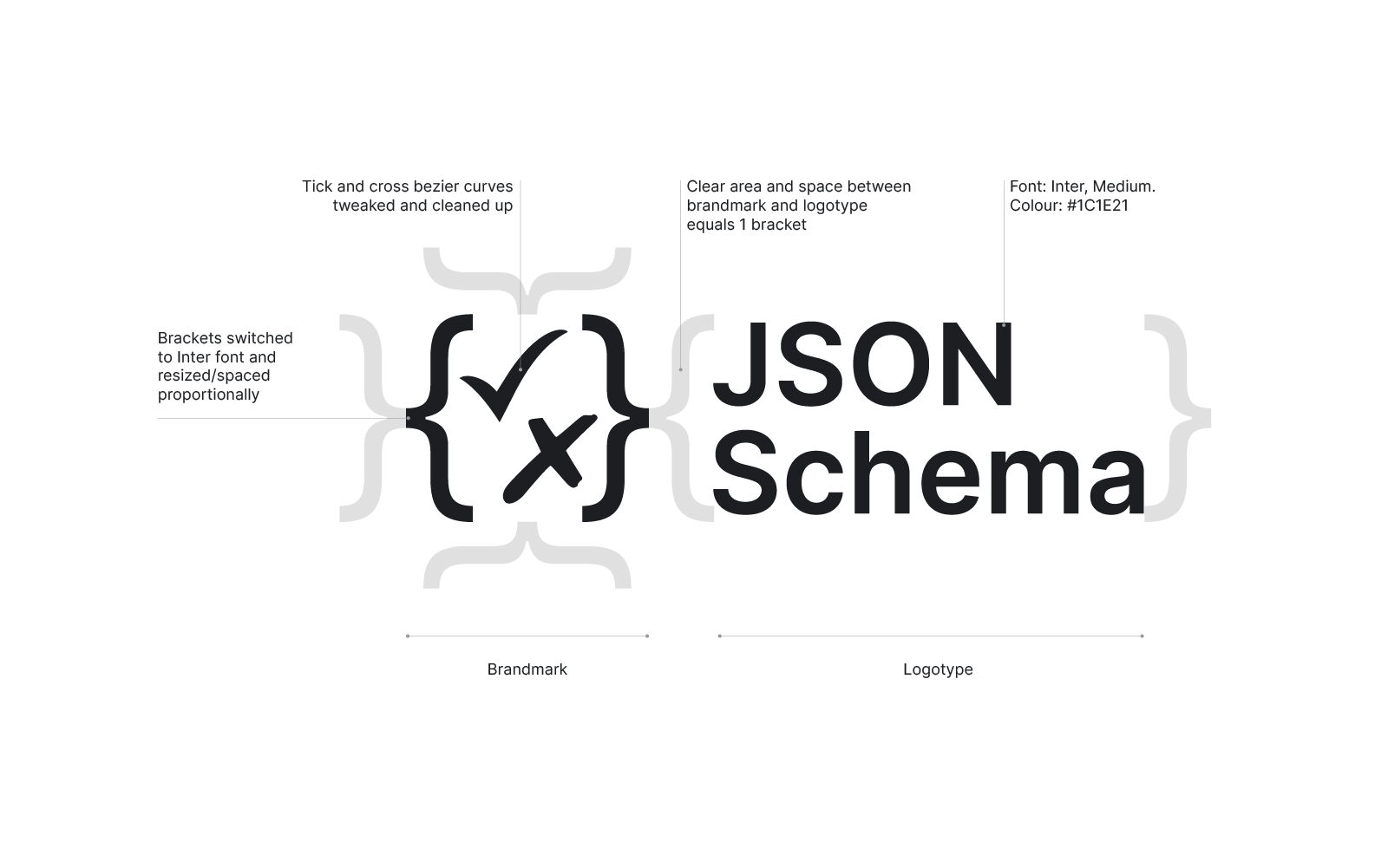
Illustration and Pictograms

To extend the collateral we have to look at other aspects that can support the styling and help embody the brand. We set about designing a series of illustrations and iconography, that could be used as graphic devices to support and break up large chunks of text and provide some contextual support to the documentation.
As with all Illustrations these start as doodles in a sketchbook that never to see the light of day.
But this is an important part of process because these doodles are a very quickly start to see what works, what shapes do you keep drawing and what percolates to the surface. If you have to draw it as opposed to copy and pasting you really need to think about what is worth drawing. As we develop the ideas for the iconography and illustrations we start to transfer these ideas over to Adobe Illustrator to develop a hig-res look and feel. This also allows us to export the artwork as SVGs so, they can be animated at a later stage.


Colour Development
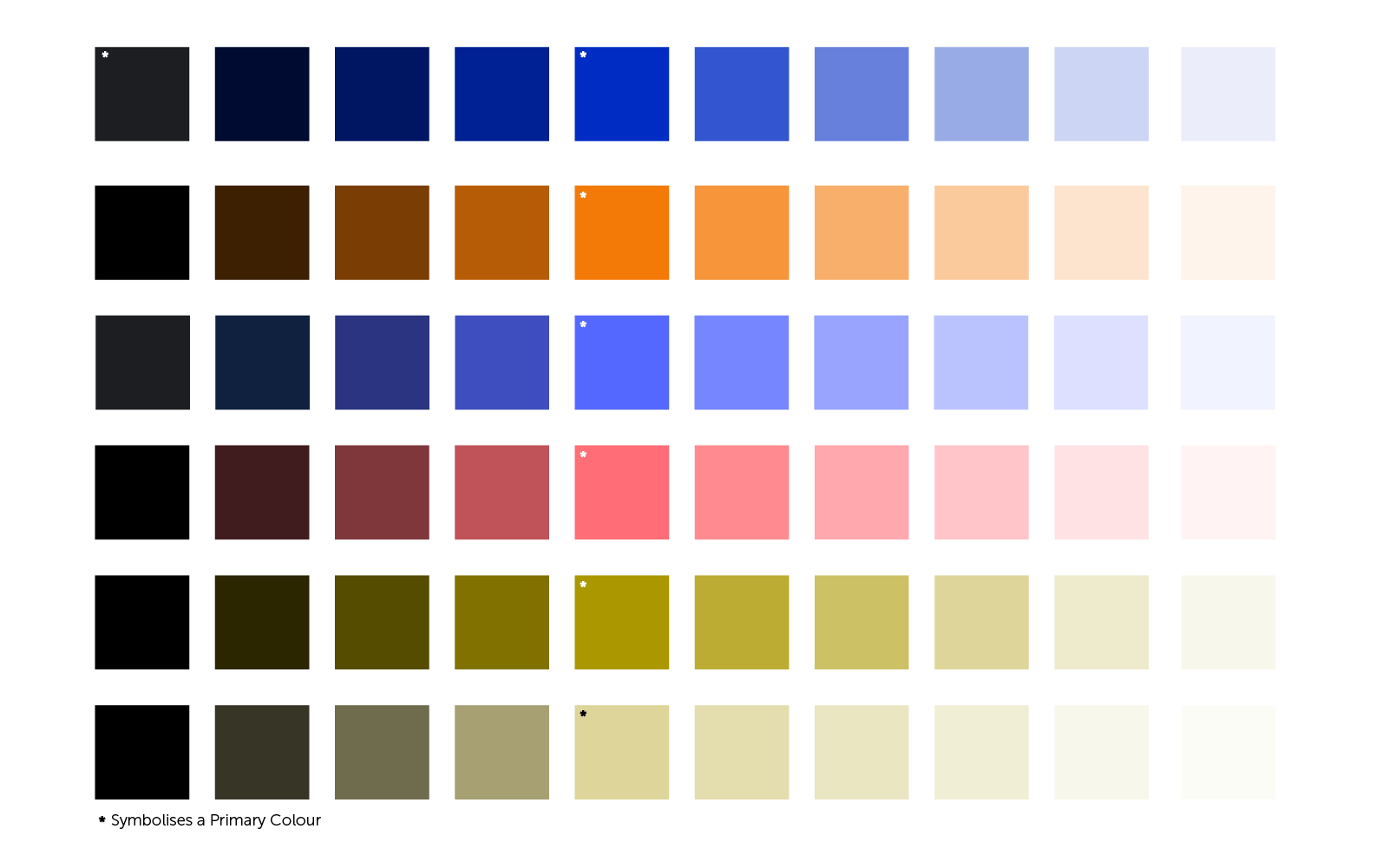
We designed a colour safe palette centred off a vibrant blue. In terms of colour psychology the colour blue promotes: Loyalty, Trust, Stability, Harmony, Peace, and can be Calming. In terms of developing a colour palette we start with an approved primary colour and begin the process of sourcing complimentary suite of colours to support the primary colour. Looking at the colour wheel we opted for a strong orange and added some muted olives and greens to help balance out the electricity of the blue.
With all colourways that we develop we check them for accessibility against colour vision deficiency. To quickly check the colours for accessibility we use the Color Filters within Microsoft's Accessibility options. This provides a quick simulation of how the colours will be perceived by someone who has Deuteranopia (Green weak), Protanopis (Red Weak), or Tritanopia (Blue Weak). In a previous post I highlighted a series of other tools that can help with developing a colour safe colour palette.
Fonts
In terms of fonts we kept it simple and retained the Inter ad the primary font. It has a clean, clear, open quality that we used on the logotype and with a range of cuts which we can use to emphasis areas of documentation plus Google Fonts do a pretty good job at making fonts available to all.
By sketching out the basis of a brand, starting with the Brandmark, logotype, colourway, contextual artwork/illustrations, and fonts we begin to formulate the foundations of a brand which enables us to progress the designs in to designing the website. Up until this point we had very little brand guidelines to explore so, by helping to develop the brand we could extend the palette of collateral we had to work with.
Website Design
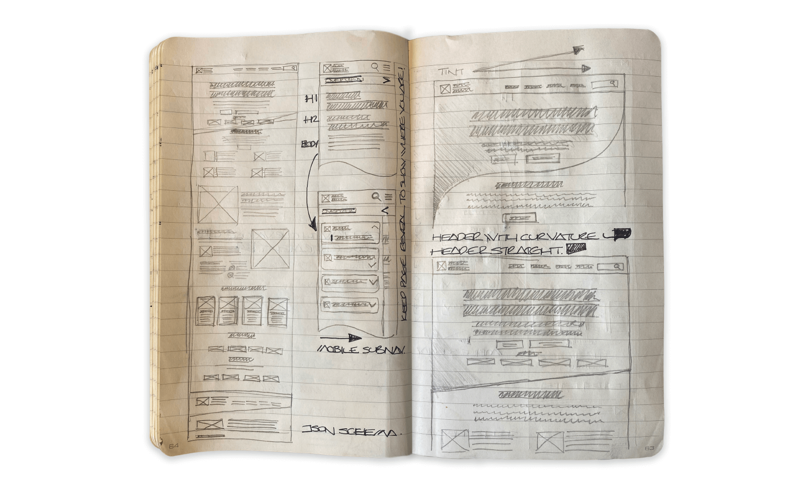
Taking the collateral that we had developed we used this as the foundations to design the site. We sketched out our website design as wireframes before transferring over to Figma. Wireframes are the basis for rapid prototyping because you can begin to see what works and a very lo-fi and cost-effective way. We developed a series of templates which for a Homepage, Documentation page, Blog gallery with categories, and a Blog Content page which is slightly different to the Documentation page that supports the extensive JSON Schema documentation.
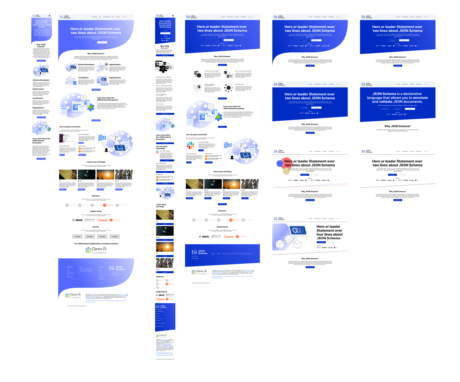
In the early ideas we tried to get the curvature of the parenthesis as a graphic device to help enforce that as a strong part of the identity however, as we developed the ideas a clean less fussy look was opted for. We worked on mobile solutions in tandem with larger devices sizes as its much easier to consider mobile and accessibility from the start rather than try to bolt it on at the end.
As we developed the designs Benjamin, and his team Johannes Linowski, Akanksha Kushwaha, Roni Lookwood, and Melinda Gutermuth of developers were developing the site. It had to come together quite quickly so the there were many different roles involved. As we designed the pages and updated the Figma file all that information was instantly available to the development team.
The project is ongoing, but this is where we are at now with a revised look and feel to the JSON Schema site. We’re about to embark on the next phase of design.